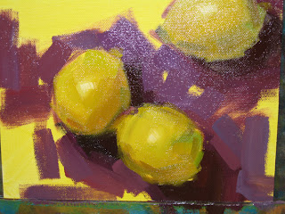
"Purple Shadows" --- SOLD


Click Here to Bid

I was inspired by the students in my workshop to return to some brighter colors and more dramatic color combinations. Purple and green seemed like a good place to start. It always takes me a few days to get back into the swing of things after I've taken a little break, so bear with me. This one looked better on my easel...

Workshop Photos


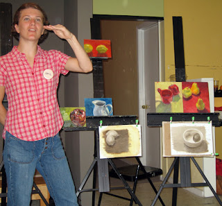
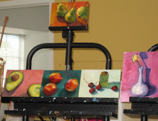
Here are some paintings from the students in my workshop. They did such a great job!


Here's my partial demo of lemons. It no longer exists.


And here I am teaching, with some more class paintings behind me. (What the heck am I doing with my hand?) Thanks to Vicki who took the photos, and thanks to everyone is the class for making my first workshop a wonderful experience!!!

"Juicy" --- SOLD


Well, I have to say I think my first workshop was a success! We had a great time, and everyone painted really well. I did a quick/partial demo the first day, and although I liked the start, I wiped it off because I knew I wouldn't have time to finish it. I didn't know anyone would want to see it (I got a couple of comments yesterday to the contrary). I didn't even take pictures. But I did see my friend snap a few so I have asked her to send me some and will post one or two when I get them.

And speaking of workshops, the one in Santa Fe in September is almost full, so if you were considering it, now is the time to register. You'll find the info for that over on the right side of this page.

"Breakfast" --- SOLD


The first day of my first workshop went really well. I thoroughly enjoyed myself. Everyone painted really well, and I think had a good time too. Maybe it was the cookies I brought, I don't know. :) Now for a good night sleep and back tomorrow. This orange painting was an extra I did a few days ago.

"Single Rose 2" --- SOLD


Well, I meant for the rose to be the focus of this painting, but maybe it's more the vase? I'm not sure. I've always liked the idea of having two fabrics together with different patterns. Kind of busy maybe, but I like it. I finally felt ready to attempt it.

I'm teaching my first ever workshop this weekend, but I hope to have something to post anyway. We'll see.

"Glass Vase" --- SOLD


My camera has failed me. It's a nice camera too. No matter how I photographed this painting, my camera would not pick up the purple in the vase. The thin stripes are the correct color, kind of a tealy blue, but the wider stripes are much more purple. I suppose only the winner of this painting will be able to view it accurately.

A friend of mine, Kathleen McElwaine, lent me this vase to paint. She's a fantastic artist herself, and a sweet gal for thinking of me.

"Rose of Sharon" --- n/a


I have a lovely Rose of Sharon Tree in my backyard. I started it years ago from a tiny little sapling growing up under my grandmother's version of the same. The flowers from it are wonderful, though I must admit this one drooped rather quickly once picked. I was smart enough, this time, to paint in the flower FIRST, and the background afterwards.

"Polka Cups" --- SOLD


I painted this with the specific goal of loosening up. I was inspired by the loose paintings of Sally Cummings Shisler, my long-distance daily painting buddy. It was really tough to keep the proportions correct while being loose at the same time. In fact, painting loose is tough for me because it's ... unreal. Errr, in real life, the edges are straight and perfect and crisp, and painting loose means kind of suggesting those edges without adhering too much to reality.

I have 2 words tacked to my wall beside my easel. One is "squint," and the other is "interpret."

"After Tea" --- SOLD


I found this perfect, green teacup and saucer at the thrift store recently. Up until today I could not find a good background for it. But then I found this white napkin and it fit perfectly. I think teacups are challenging because if you don't get the proportion just right it's very obvious. Also, the rim of the cup, for some reason, is always a bit tough. I'd like to think I'm getting better and better at it.

"Cup & Apple" --- SOLD


I've officially run out of interesting title ideas.

"Cup & Plums" --- SOLD


Similar color scheme as yesterday. I am enchanted with these purply-red plums against the light turquise background. A friend told me recently she'd learned never to have objects "kiss" in a still life - touch each other but just. I suppose this is a rule I break frequently. Call me a rule-breaker. :)

"Marching Plums" --- SOLD


I was in marching band in high school. I played the clarinet. I was part of the smallest band in Texas - 21 at our largest, and we were pretty good - made it to state every year. These plums reminded me of all the parades we marched in.

My Round Rock workshop is full. Wow. I'm thinking about offering another next Spring.

"Me and My Shadow" --- SOLD


Click Here to Bid

Thank you all so much for your kind comments on yesterday's post. I am much happier with today's painting. I showed my husband and he said "now that's you."

"Yellow Apple" --- n/a


I don't think the photo does this one justice, but I'm not sure I did either. This is another experiment. I was trying a more traditional angle. I have this theory that if you never try new things, you won't grow. And it makes sense that some, ok a lot, of the things you try aren't going to work out. So, in effect, you've got to fail to grow. Kind of like: no pain no gain. I think this is the ONE down-side of daily painting - the public aspect: everyone sees your failures. There are some things I like about this painting, but over-all I don't think it's up to par, so I won't list it on ebay. If you're interested in buying it, email me with an offer. Thanks.

"Scallions" --- n/a


One of the great things about painting every day (well ... almost every day) is that you are free to experiment - try all sorts of things. This is today's experiment. I've been looking for a reflective surface to put under my setups. I finally just got a large peice of glass and put it over a white cloth. I didn't notice until, looking at it small like this, that the jar is leaning a bit, and the reflection is leaning the other way. Oops. Well, that's another great thing about painting every day - there's always tomorrow!

"One Down" --- SOLD


I've been trying to get a bottom view of one of these pears, and I finally worked it into a composition. Cool.

They taught us in school that successful paintings have lines that lead you to the point(s) of interest, and in general keep your eye moving around the painting. I've never really been able to plan for that in a painting. When it happens ... it happens. Maybe someday I'll be that good. In looking at this painting now, I see some lines that lead to the pears, but everything escapes out the top of the painting. Is that bad?

"Confrontation" --- SOLD


I will be teaching a 3-day workshop in Sacramento CA, October 19th, 20th, & 21st, at the 20th St. Art Gallery. If you are interested in attending, please visit the 20th Street website and click on the "upcoming" link. You can contact the gallery to register.

Usually I put an undercoat on my panels right before I paint so that I have a nice color to begin with, and so that my surface is just a little wet (I find it helps the paint spread). To do this I thin a color with a lot of turp, paint it over the surface, and then wipe it off well with a paper towel. Sometimes I end up wiping a panel later because the painting isn't turning out, and don't get to paint on it again until the next day. When that happens, I have a dry undercoat, as with this painting. I find it gives me an interesting result, especially when the majority of the painting is a light color.

"Cozy Pears" --- SOLD


I find it hard to paint fruit that isn't shiny for some reason. But hey, it's a challenge, and I'll probably try them again tomorrow. I generally like to do one thing several days in a row. I think I improve with each try ... and then at some point I get bored and that's when I move on to something else.

"Adopted" --- SOLD


So, yesterday I had some extra time when I was done painting. Jacob hadn't yet woken up from his nap, so I put together a still life for the next day, (today) to get a head-start. And today when it was time to paint, I came up to my studio and started painting ... and found I just couldn't get into it. I wasn't motivated, at all. So I wiped it off and started over, and got this. It seems I've got to paint what I'm excited about right now, rather than what I was into yesterday. Makes sense. It's that spark - it doesn't happen otherwise.

For those of you who don't know, my husband and I adopted our son, Jacob, ~2 years ago when he was 2 days old. This setup reminded me of the differences and similarities between us and him. He's such a joy in our lives. Here's a picture of Jacob.

"Oleander" --- SOLD


Oleander is poisonous. Ever since I found that out, I feel funny even touching it. But I've always loved the long, slender leaves, and the various colored flowers. I planted 5 bushes in my backyard years ago, and the bush this came from was the only one to survive the first winter.

It appears my Round Rock workshop is almost full. Only one spot left. If you were waiting for a sign, this is it.

"White Set" --- SOLD


Click Here to Bid

I decided to really focus on value with this painting, and what better colors than black and white. I couldn't leave out color altogether though, hence the orange. I think I would probably benefit from doing a value study before EVERY painting, but who's got the time?! I am very happy with how the polka-dot cup reflects the orange.

"Apple Batik" --- SOLD


So...I've painted this fabric a few times before. I like it. And I'm finally finding a method that works. First I lay down the lighter teal color in a really loose way. Then I come back with the darker blue and kind of cut into the lighter design to define it. I suppose if it were the other way around (the design dark and the rest light) then I would start with the dark and cut back in with the light. Also, when I'm cutting in with that darker blue, I like to make it a little too dark to start with, and then come back with the "right" value and not go all the way to the edges with it. I find that kind of defines the design better. Does that make any sense??? Also, I am constantly remixing the same color so it's not so boring a flat.

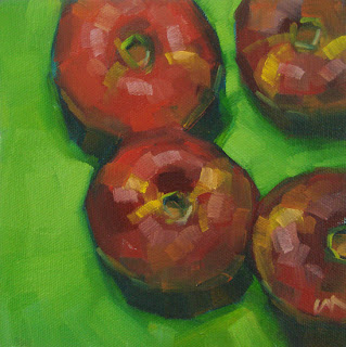
"Fancy Apples" --- SOLD


I don't seem to be able to link my title to my ebay auction today, hence the link below the picture.

Apples are pretty much my favorite subject to paint for several reasons: 1. they NEVER go bad ... errr, they do, but it takes a month or more, so I always have a few in my studio. 2. they can be very varied ... in color, with bits of green or orange tucked in. 3. they usually have nice stems 4. they're shiny - great reflections.

So, try not to be jealous, but I had a very nice dinner last night with Qiang Huang and Justin Clayton (& spouses). It was so great to talk all about daily painting, ad nauseum. We stayed up until 12:30, which for us old fogies :) was pretty late. We had a great time. Afterwards, it was too late for me to post, which was for the best as my painting yesterday wasn't up to par.

"All Gone" --- SOLD


I've always read about lost edges, but this is the first time I've created one - on purpose, and had it work. Can you find it?

Cups are a real challenge to paint. I thought about them over the holiday and had some new ideas. The main idea, and I hope I can say this clearly, was to...wherever there's an edge (2 colors meet)...paint past the edge with the first color, and then come back with the second color and kind of cut it off where it needs to be. That instead of painting up to an edge and having an awkward gap or line. Does that make sense? These are the kinds of things I think about in my spare time. I can't tell you how many times my husband has said, when I've been quiet for a while, "so, you painting in your head again?"

"Saucer Nectarines" --- SOLD


These are like small, sort of flat, peaches, but darker: saucer nectarines. I've been eyeing them at the grocery store. I'm still not sure you can tell they're flat here, but oh well. I felt they really popped against this green background.

"Artichoke" --- SOLD


The picture's not great on this one...somehow my magic picture taking spot put glare everywhere. Argh. I did my best to correct it in photoshop so it's as much like the original as possible.

There are a lot of subtley different greens in this artichoke, and I feel I really learned a lot in painting it. I learned to look carefully at the differences between colors, but also that if I look too close I get too caught up in the detail and lose it. I RE-realized I have to interpret what I see, not just reproduce.

"Circles" --- SOLD


I found this transparent, yellow plate at the thrift store and thought it would be "fun" to paint it over polka-dots. It was a real challenge getting the colors right. In a situation like this where the colors are subtle shifts, and my brain is busy playing tricks, I find it most helpful to compare a lot. So I put down one color and then look at the color next to it and think "is that more red?", and then add what I think it needs to the color I've already got. It doesn't always work... I also use a lot of trial and error: mix - try it - mix again - etc. Sometimes the "wrong" colors that I try and then fail to completely cover up when I remix can leave interesting bits of color in spots. Sometimes...

I didn't realize until after I'd finished the painting that there's nothing but circles in it.
Related Posts Plugin for WordPress, Blogger...